on friday dec. 5th, i went to a critique for students in the retail class. they had to design shops for either biomech mills or the shops at buffalo bridge. my favorite was for a store called overcast. it was a boutique for outerwear and luxury office goods. one of the first reasons i liked it is because of the concept and mood. i LOVE rainy days and overcast weather and the student did a good job of conveying that mood throughout the presentation. i know that i personally was drawn into her design and could visualize it as a real store. i could also tell that she put a lot of thought into developing her ideas from the precedent of a cloudy day streetscape. every detail was thought out and her drawings were amazing.
looking at all the presentations, i learned that it is important to really sell your design and concept. make the audience want to see your plan become a reality. i also learned that every detail is important. skipping a few minor things might not seem like a big deal, but it is guaranteed that somebody will notice it in your presentation. overall, i am looking forward to my future in this program. i got to see the kind of thought and process that goes into design work and i am excited to get to that level!
Tuesday, December 9, 2008
pathways.edges.boundaries: final model
Monday, December 8, 2008
BOUNDARIES... first model

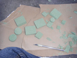
we made our first model 12 in x 12in. above is the mold for the top of our structure, below is the base, which is uniform throughout the four structures in the building edge.


 when we took the concrete out of the mold, it ended up cracking. this told us that we needed a bigger aggregate than kitty litter. so for the next model, we used pea pebbles.
pathways.edges.boundaries: research
our first task was to do research about the history of the gatewood/weatherspoon parking lot. my group found out that in 1891 before the university opened, the land where gatewood is consisted of farmland. the area was unsuccessful as farmland and was willingly converted into the university. through the 1970s, the area around gatewood was residential. eventually the area was cleared for a gravel parking lot and later the gatewood building and the current parking lot.
Thursday, December 4, 2008
practice with perspective
Saturday, November 15, 2008
Saturday, November 1, 2008
dialog: continuing the process...

this is my sketchbook page that i used throughout the process. after my first iteration, i started thinking literally about the kinds of conversations people have. the one that stuck out to me was one person coming in and dominating a conversation. i liked this idea because it fit in with the work i had done with one narrow space and a larger space.

this is the right side of the project. i took the design of this side from the top of my previous iteration. the opening reveals the narrow space that i have created.

i decided to play more with scale and exaggerate the differences in the sizes of the spaces. i also thought more about how i defined the spaces. continuation allows the eye to recognize two distinct spaces without the larger space being completely delineated.
opening doors
playing games
Tuesday, October 28, 2008
site plans

for this one i experimented with making the building light and the area around it dark. it was time-consuming to shade in all the topography lines. but it was worth it because i like how it turned out.

this is the same drawing with the building and trees dark. it took less time, but it's not as pleasing to me as the first one.


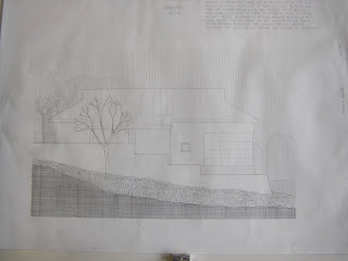
for the site plan of my house, i tried showing the direction and shading on the roof using lines and different spacing. although i don't like the look of a dark building on a light background that much, in this case i think it works.
Sunday, October 26, 2008
dialog: first iterations

my initial idea was to create one space that is closed off and narrow. this iteration was very flat and possibly could have been considered one space since the triangle cutout opened into the same narrow space.

this shows the narrow space along the sides that i was trying to create.

my second idea was inspired by thinking literally about conversations. i came up with the idea of one person coming in and dominating the conversation. so i created one broad space and a small confined space on the back side.

suzanne's sessions: cell phones and twigs

this is the group of sixteen drawings. in each of them, i incorporated images from both the cell phone and twig images. at first it was hard for me to decide how to alter previous images to create new ones. but once i just started going with the flow, i got things that i really liked.

for my eight images i used mostly rotating and exaggerating. i like the fact that it's hard to see that these designs came from cell phones and twigs.
 this is the final four images. i am really happy with them because i made these by combining my favorite images from before.
nadia's sessions
 these are my favorite from the first day of drawing fixtures throughout the building. i used cross contour and perspective drawings.
the second day was drawing lighting fixtures. the hardest part about drawing this light was getting the curves exactly how i wanted them. it was also hard to get used to the view finder and drawing only what i saw through it.

these are my favorite drawings from day three of drawing architectural details. on the left is a door hinge and on the right is a set of pipes beside a vending machine. with the door hinge, i tried to capture the reflection of light off the metal plates. i really liked this view of the pipes, so i drew it larger below.

Wednesday, October 22, 2008
questions about dialog
how is dialog created?
-often dialog can be created through similarities between the two spaces. many projects had spaces with a shared side or skewers that run through both spaces. the spaces have some clear relationship, such as a space within a space or spaces back to back. the dialog can also be created through continuation and proximity without the spaces actually touching.
how is a sense of space/place defined?
-space can be defined through using the paper or skewers or a combination of both. proximity is important in deciding when two objects are close enough to delineate a space between them. it is also used in determining when when one space becomes two. in my project, the large space is defined through two sides that suggest a space, but do not completely close the space.
how is the idea of system generated?
-a system is a series of parts that work together as a whole. this can be created through modules coming together in the whole. modules allow for repetition which can create a certain rhythm. a lot of people also worked off of a grid format that automatically helped the spaces fit cohesively within the whole.
how does the joinery support the project concept/strategies?
-during the critique, i noticed that sometimes joinery can be used to emphasize the most important parts of the project. it can also be used simply for structure and support.
how is scale utilized in the project?
-in my project, i intentionally played with scale by having one closed narrow space next to a much larger, less defined space. scale can also differentiate between primary and secondary spaces. sometimes if the intended spaces are large enough, the smaller secondary spaces don't necessarily 'count as spaces.'
how do two-dimensional images add to the understanding of the project?
-drawings and graphics can serve to simplify the design or to show details that may be missed. images can also show process.
how did the initial project idea evolve?
-listening to others at the critique, i found that many people started the same way i did: thinking literally about types of dialog and how two spaces might depict that. my idea came from the way one person comes in and dominates a conversation. i chose to express that with a small constricted space and a relatively large space.
Wednesday, October 15, 2008
unity: final design
Sunday, October 12, 2008
Subscribe to:
Posts (Atom)


