on friday dec. 5th, i went to a critique for students in the retail class. they had to design shops for either biomech mills or the shops at buffalo bridge. my favorite was for a store called overcast. it was a boutique for outerwear and luxury office goods. one of the first reasons i liked it is because of the concept and mood. i LOVE rainy days and overcast weather and the student did a good job of conveying that mood throughout the presentation. i know that i personally was drawn into her design and could visualize it as a real store. i could also tell that she put a lot of thought into developing her ideas from the precedent of a cloudy day streetscape. every detail was thought out and her drawings were amazing.
looking at all the presentations, i learned that it is important to really sell your design and concept. make the audience want to see your plan become a reality. i also learned that every detail is important. skipping a few minor things might not seem like a big deal, but it is guaranteed that somebody will notice it in your presentation. overall, i am looking forward to my future in this program. i got to see the kind of thought and process that goes into design work and i am excited to get to that level!
Showing posts with label IAR 110. Show all posts
Showing posts with label IAR 110. Show all posts
Tuesday, December 9, 2008
Thursday, December 4, 2008
practice with perspective
Tuesday, October 28, 2008
site plans

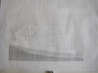
for this one i experimented with making the building light and the area around it dark. it was time-consuming to shade in all the topography lines. but it was worth it because i like how it turned out.

this is the same drawing with the building and trees dark. it took less time, but it's not as pleasing to me as the first one.


for the site plan of my house, i tried showing the direction and shading on the roof using lines and different spacing. although i don't like the look of a dark building on a light background that much, in this case i think it works.
Sunday, October 26, 2008
suzanne's sessions: cell phones and twigs

this is the group of sixteen drawings. in each of them, i incorporated images from both the cell phone and twig images. at first it was hard for me to decide how to alter previous images to create new ones. but once i just started going with the flow, i got things that i really liked.

for my eight images i used mostly rotating and exaggerating. i like the fact that it's hard to see that these designs came from cell phones and twigs.
 this is the final four images. i am really happy with them because i made these by combining my favorite images from before.
nadia's sessions
 these are my favorite from the first day of drawing fixtures throughout the building. i used cross contour and perspective drawings.
the second day was drawing lighting fixtures. the hardest part about drawing this light was getting the curves exactly how i wanted them. it was also hard to get used to the view finder and drawing only what i saw through it.

these are my favorite drawings from day three of drawing architectural details. on the left is a door hinge and on the right is a set of pipes beside a vending machine. with the door hinge, i tried to capture the reflection of light off the metal plates. i really liked this view of the pipes, so i drew it larger below.

Tuesday, September 30, 2008
logs...
Monday, September 29, 2008
Thursday, September 18, 2008
blind contours!
Tuesday, September 9, 2008
Five Messes
 this is my basket of hair products. i drew this one in pen just to try something new. i also wanted to work on what they say in class about drawing strong lines instead of hesitant ones. this made me more hesitant when i was drawing because i wanted to get the lines just right. but once i put the pen on the paper i was forced to commit to the line, which was my whole purpose.
Tuesday, September 2, 2008
random things
 these are the five most interesting things i had in my purse... sunglasses, lip gloss, a pair of bracelets, scissors, and an ID pouch. my favorite things are the lip gloss and the sunglasses. the sunglasses and the pouch took the longest... the sunglasses because it was hard for me to get the shape exactly right... the pouch because of the detail with the pattern.
upside down man
 i know this man is not upside down now, but the assignment was to draw him upside down. this was a challenge for me because it is natural to rely on previous knowledge of what body parts and other objects look like when drawing. it is hard to do that when drawing upside down! instead i just had to focus on drawing the lines that were right in front of me.
Monday, September 1, 2008
Thursday, August 28, 2008
exploring blogs...
so i was looking at other blogs for class, not really knowing what to expect or if i would even like any of the ones they suggested. i actually really liked crack skull bob's blog. i liked it because it had a variety of things in it. the cartoons were cute, especially the still life with overweight people. my favorite piece was the "self-loathing portrait." i liked how he used a lot of color and crazy designs but it was still very neat and fun to look at. the captions also made the blog even more interesting.
www.crackskullbob.squarespace.com
www.crackskullbob.squarespace.com
Subscribe to:
Posts (Atom)


